Introduction
TableLayout is an advanced Layout Group system inspired by HTML tables.Features:
- Easily line-up elements using rows and columns for professional looking forms and user interfaces
- Show lists of data such as leaderboards/etc. in a clear and easy-to-read fashion
- No programming required (but you can create/modify tables with code if you wish)
- Easily Add and Remove Rows/Cells, even at runtime
Working with TableLayout
Adding a new TableLayout
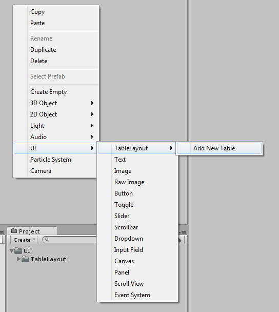
To add a new TableLayout object, right-click the desired location in the hierarchy window, and select
UI -> TableLayout -> Add New Table.

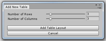
You will then be presented with the following wizard:

This will allow you to select how many rows and columns the new table should have by default. You can always add/remove rows and columns later if you wish.
</AddingANewTableLayout>
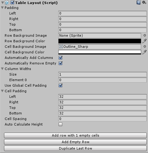
The TableLayout Component

-
Padding
Specifies the padding around the entire Table.
-
Row Background Image
Specifies the image to use as the background for each row.
-
Row Background Color
Specifies the color to use for each rows background image.
-
Cell Background Image
Specifies the image to use as the background for each cell.
-
Cell Background Color
Specifies the color to use for each cells background image.
-
Automatically Add Columns
If this is set, then the TableLayout will automatically add entries to Column Widths if any row has more cells than there are entries in Column Widths.
Essentially, this allows you to have TableLayout automatically handle column widths in the same manner as an HTML table.
-
Automatically Remove Empty Columns
If this is set, the TableLayout will automatically remove entries from Column Widths if there are columns specified in Column Widths which have no cells in them.
-
Column Widths
Specifies the width of columns in the table. To have a column automatically sized by TableLayout, specify its width as 0.
-
Use Global Cell Padding
If this is set to true, then the Cell Padding value specified for this TableLayout will be applied to all of its cells.
-
Cell Padding
The padding value to use for each cell in this TableLayout if Use Global Cell Padding is set.
-
Cell Spacing
Specifies how much space to leave between cells.
-
Auto Calculate height
If this is set, the TableLayout will automatically set its own height. This is only useable if each row within the TableLayout has a preferred height set.
-
Buttons
-
Add Row with X New Cells
This will add a new Row with a full set of empty cells (using the number of entries in Column Widths to determine how many cells to add).
-
Add Empty Row
This will add a new Row with no cells.
-
Duplicate Last Row
This will add a new row which is a copy of the last row in the table.
-
Add Row with X New Cells
</TheTableLayoutComponent>
The TableRow Component

-
Preferred Height
Sets the height of this row. If the value is 0, then the height of this row will automatically be calculated by the TableLayout.
-
Dont use Row Background
If this is set, then you can override the default row background image and color for this row (by modifying the Image component). If it is not set, then TableLayout will override any values set with its own.
</TheTablerowComponent>
The TableCell Component
Cells store the actual contents of your layout.

-
Column Span
How many columns should this Cell span?
-
Dont use Table Cell Background
If this is set, then you can override the default cell background image and color for this cell (by modifying the Image component). If it is not set, then TableLayout will override any values set with its own.
-
Override Global Padding
If the TableLayout is set to use Global Cell Padding, setting this value will allow you to override that Global Cell Padding for this cell.
-
Padding
Sets the padding for this cell.
</TheTablecellComponent>
Working with Code
TableLayout
Adding Rows
You can add more rows using theAddRow method. If no argument is specified, then this method will add a new row with a full set of empty cells (as per Column Widths). Alternatively, you can specify a number of cells you wish to add.
Example
TableRow newRow = tableLayout.AddRow();
newRow.preferredHeight = 128;
Accessing Rows
The rows of a TableLayout object can be accessed through itsRows property, e.g.
Example
TableRow firstRow = tableLayout.Rows[0];Properties
All TableLayout properties can be accessed and modified through code as per the inspector.Forcing Updates
If you make adjustments to a TableLayout at any level, it will under most circumstances automatically pick up the changes and update. If however, it does not, you can force an update as follows:Example
tableLayout.CalculateLayoutInputHorizontal();
</TableLayout>
TableRow
Adding Cells
You can add more cells using theAddCell method. You can optionally specify content for the cell by providing a RectTransform as an argument.
Example
TableCell newCell = tableRow.AddCell();
newCell.columnSpan = 2;
Accessing Cells
The rows of a TableLayout object can be accessed through itsCells property, e.g.
Example
TableCell firstCell = tableRow.Cells[0];
</Tablerow>
TableCell
All TableCell properties can be accessed and modified through code as per the inspector.
</Tablecell>
