Getting Started
Quick Start
There are several prefabs to get you started – you can add them to your scene using the standard GameObject menu (under UI -> Pagination). Simply select the prefab which most closely matches your needs, and click the menu item to add it to the scene. If there is no Canvas and/or EventSystem in your scene, they will automatically be added for you.

</QuickStart>
Prefabs
Each prefab is a starting point from which you can build your own customized PagedRect. You should pick the PagedRect which most closely matches your requirements and customize it from there.
You can change just about anything in the Prefabs, so you are not limited to the default appearance or positioning of, for example, the pagination which you can style and reposition by modifying its Image and RectTransform components.
Horizontal Pagination - ScrollRect
This is a default PagedRect, configured to scroll horizontally, with horizontal pagination.

Vertical Pagination - ScrollRect
This is a default PagedRect, configured to scroll vertically, with vertical pagination.

Slider - ScrollRect
This is a default PagedRect, configured to function as a simple image gallery. Each page in this prefab already has a nested image object which you can replace with the images of your choice.

Page Previews - Horizontal
This is a horizontal PagedRect utilizing the 'Page Previews' functionality, which shows a scaled-down version of the next and previous pages. By default, the pagination for this prefab is hidden, but you can enable it if you wish.

Page Previews - Vertical
This is a vertical PagedRect utilizing the 'Page Previews' functionality, which shows a scaled-down version of the next and previous pages. By default, the pagination for this prefab is hidden, but you can enable it if you wish.

Slider - ScrollRect [With Nested ScrollRect]
This is a customized version of the 'Slider' prefab with pages containing ScrollRects, allowing you to scroll both left/right and up/down in the same PagedRect.

Note regarding usage with Unity 2017.2+
Note: this will only affect you if you are using a dynamically sized text object like the one on Page 4 of the template.
As of Unity 2017.2, there is an interaction between the 'Text' component on Page 4 of the template and its parent 'VerticalLayout' group.
The VerticalLayout group works in concert with its 'ContentSizeFitter' component to automatically resize the 'Text' object based on its content (how much text there is).
Prior to Unity 2017.2, this worked with no issues - however, in Unity 2017.2, using these components together will result in performance issues when dragging the PagedRect.
Fortunately, this is easily solved by disabling the VerticalLayout component once the text has been set. If you would like to change the text at runtime, then simply enable the VerticalLayout component prior to changing the text, and then disable it again once you are done.
Tabs - Horizontal - ScrollRect
This is a horizontal PagedRect with pagination set up to function as tabs.

Legacy PagedRect Prefabs
The Legacy PagedRect Prefabs pre-date the inclusion of Unity ScrollRects. They are included with PagedRect in the interest of backwards compatibility, and should not be used for new projects unless you wish to use non-scrollrect functionality (such as fade animations).
These prefabs are, specifically:- Horizontal PagedRect
- Vertical PagedRect
- Slider PagedRect
</Prefabs>
PagedRect Structure
Viewport
The Viewport object a) defines the visible area for the PageRect, and b) contains the page objects. It can also contain the optional New Page Template (which can be used if you wish to add pages dynamically at run-time).Pagination
The Pagination object contains buttons, and the templates used to create buttons dynamically.
- Button – First Page
- Button – Previous Page
- Button – Next Page
- Button – Last Page
These buttons may be customised however you like, should you wish to use them. They are optional.
-
Button Template (Current Page)
This is a template which defines the appearance of the page button representing the current page.
-
Button Template (Other Pages)
This is a template which defines the appearance of page buttons representing pages other than that of the current page.
-
Button Template (Disabled Page)
This is a template which defines the appearance of page buttons representing pages that are disabled.
This template is only required if you intend to use disabled pages (such as, for example, in a Wizard)
Please note that if this template is missing, then PagedRect will just use the 'Other Pages' template for disabled buttons, with its interactable state set to false.
The Pagination object also contains the actual buttons themselves – using the format Button – Page X (where X refers to the page number). You should avoid making any changes to these buttons directly – rather edit the templates instead.
Scrollbar
This object is a standard Unity Scrollbar which can be used in addition to (or in place of) pagination. It is hidden by default and can be enabled using the ScrollRect - Show Scrollbar property.
</PagedrectStructure>
The PagedRect Component
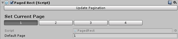
The Update Pagination Button
Clicking this button will force the PagedRect to update its state to match its contents. Normally this will happen automatically, but in some cases it may be necessary to click the button to force an update.Pages
-
Set Current Page
This section will allow you to set the currently visible page of this PagedRect in the editor. This will make the current page visible, and hide all others. This will not affect the PagedRect during runtime, only in the editor.
-
Default Page
This specifies the default “Current Page” of this PagedRect at runtime
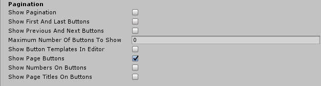
Pagination
-
Show Pagination
If this property is disabled, the Pagination object will be hidden and no buttons will be visible.
-
Show First and Last buttons
Show or Hide the First and Last buttons.
-
Show Previous And Next Buttons
Show or Hide the Previous and Next buttons.
-
Show Page Buttons
If this property is disabled, then no page buttons will be shown (you can still have first/last/next/previous/etc. buttons, however).
-
Maximum Number Of Buttons To Show
How many buttons (not counting First/Last/Next/Previous) should be visible at once? (0 = No Limit)
-
Show Button Templates In Editor
If this property is enabled, the Button Templates (for the Current Page, Other Pages, and Disabled Pages) will be visible in the editor (but not at runtime). Enable this property when you wish to edit the appearance of buttons, and disable it when you wish to see the Pagination as it will appear at runtime.
-
Show Numbers On Buttons
If this property is enabled, buttons will show page numbers.
-
Show Page Titles On Buttons
If this property is enabled, buttons will show page titles (which are drawn from Page.PageTitle)
Legacy [Non-ScrollRect] Animation

-
Animation Type
Specifies what type of animation (if any) is shown when switching from one page to another.
The options available are None, Slide Horizontal, Slide Vertical, and Fade.
Note: this is only used by Legacy PagedRects which do not use a ScrollRect.
-
Animation Speed
Specifies how fast (or how slow) the animation should be played.
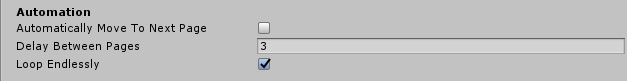
Automation
-
Automatically Move to Next Page
If this property is enabled, this PageRect will automatically move to the next page after Delay Between Pages.
-
Delay Between Pages
Specifies how long (in seconds) this PageRect should wait before moving on to the next page.
-
Loop Endlessly
If this property is enabled, this PageRect will automatically return to the first page after reaching the last page (after Delay Between Pages).
Note: This will also apply to reaching the last/first pages when using the next/previous buttons (or any other kind of input).
New Page Template

This specifies a Page object which will be used as the template when adding new pages dynamically to this PageRect. This is optional - if you do not intend to add pages at runtime, then you do not need to modify this property.
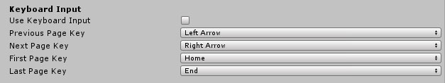
Keyboard Input
-
Use Keyboard Input
If this property is enabled, they keyboard can be used to navigate this PageRect.
-
Previous Page Key
Specifies the key to move to the previous page (Default = Left Arrow).
-
First Page Key
Specifies the key to move to the first page (Default = Home).
-
Last Page Key
Specifies to the last page (Default = End).
Next Page Key
Specifies the key to move to the next page (Default = Right Arrow).
ScrollRect
-
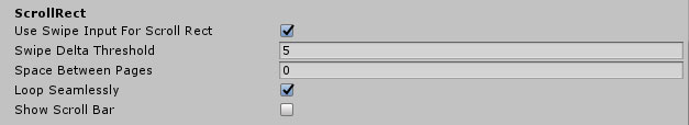
Use Swipe Input For Scroll Rect
If this is set, then the PagedRect will accept swipes to move forwards or backwards through the ScrollRect.
-
Swipe Delta Threshold
Specifies the minimum swipe distance before PagedRect will switch to the next or previous pages.
-
Space Between Pages
Adds an optional space between pages in the ScrollRect.
-
Loop Seamlessly
If this is set to true, then PagedRect will seamlessly move the first page to the end and vice versa as necessary so as to provide the illusion that the PagedRect is looping infinitely.
Please note that Seamless Looping will only be used if the PagedRect has four or more pages.
-
Show Scroll Bar
If this is set to true, then the ScrollRect’s Scroll Bar will be visible.
Scroll Wheel Input

-
Use Scroll Wheel Input
If this property is enabled, scrolling the mouse wheel up or down will move to the previous or next page.
-
Only Use Scroll Wheel Input When Mouse Is Over
If this property is enabled, scroll wheel input will only be used when the mouse is hovering over the PagedRect (if this property is not enabled, the PagedRect will respond to scroll wheel input regardless of where the mouse is).
Highlight
-
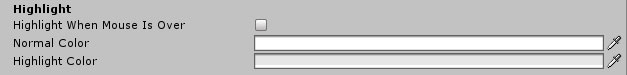
Highlight When Mouse Is Over
If this property is enabled, this PageRect’s Image component will have its color changed when the mouse is over it.
-
Normal Color
What color should this PageRects Image component be when the mouse is not over it?
-
Highlight Color
What color should this PageRects Image component be when the mouse is over it?
Events
-
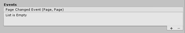
Page Changed Event
This will allow you to trigger events whenever the current page is changed through any means – the first Page argument is the New Page and the second Page argument is the Previous Page.
Page Previews
Please note: Page Previews are only available for non-legacy PagedRects.
-
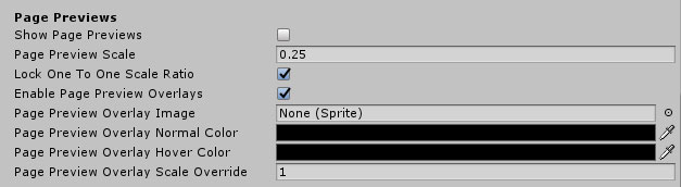
Show Page Previews
Enables or disables the Page Previews functionality.
-
Page Preview Scale
Specifies the scale to use for the preview pages. The primary page will also be scaled so as to use the remaining available space. This should always be lower than 0.33, otherwise the preview pages will be larger than the main page.
-
Lock One To One Scale Ratio
If this is false, then the previews will only be scaled vertically (in horizontal mode) or horizontally (in vertical mode). If this is true, then the previews will be scaled by the same amount in both dimensions.
-
Enable Page Preview Overlays
Page Preview Overlays are used to a) optionally highlight the preview pages when the mouse hovers over them, and b) allow the user to move to the page by clicking on it. If they are enabled, they will prevent any clicks from going through to the preview pages (but not the current page).
-
Page Preview Overlay Image
The optional image to use for the preview overlay.
-
Page Preview Overlay Normal Color
The normal color of the preview overlay.
-
Page Preview Overlay Hover Color
The color of the preview overlay when the mouse is over it.
-
Page Preview Overlay Scale Override
This property allows you to override the scale value used by the overlays in the vertical dimension (for horizontal PagedRects) or horizontal dimension (for vertical PagedRects), allowing you to create overlays which extend beyond the page itself.
References
This section defines references this PagedRect will use to locate, for example, the Viewport and Pagination objects. There should be no need for you to modify this section unless you are building a new PagedRect from scratch rather than using a prefab as a starting point.
</ThePagedrectComponent>
The Page Component

-
Page Title
This optional field defines the title of this page. This will be used if the PagedRect is set to Show Page Titles On Buttons.
-
Page Enabled
If this field is not set, then the button for this page will use the Button Template (Disabled Page) for its appearance, and will not respond to mouse clicks. You can still set this page as the current page using code, however.
-
Show on Pagination
If this field is cleared, this page will not have a button in the pagination at all. This will allow you to add hidden pages which cannot be accessed through the regular page buttons.
Please note: the 'Next Page', 'Previous Page', 'Last Page', and 'First Page' properties will only switch to pages with this property set to True.
-
On Show Event()
Any events set here will be called whenever this page is shown.
-
On Hide Event()
Any events set here will be called whenever this page is hidden.
-
Use Page Animation Type
Animation Type
(Legacy PagedRects Only)
If this property is set, then this page will use the animation type specified here rather than the one specified by the PagedRect itself.
-
Flip Animation Direction
If this property is set, then the direction of the animations for this page will be inverted.
-
Desired Scale
Specifies the desired default scale for this page, used primarily by Page Previews functionality.
Under normal circumstances, this should be left at its default values.
</ThePageComponent>
Adding and removing pages
Adding pages in the editor
There are two ways to add a new page in the editor. The simplest wa y is to:
Method One
- a. Select the Viewport object of the PagedRect in the hierarchy.
- b. Right-click on the Viewport object (or click on the GameObject menu)
- c. Select UI -> Pagination -> Page
This will add a Page prefab to the scene, update the PagedRect pagination, and select the new page. Please note that this will not use the PagedRects New Page Template.
Method Two
- a. Select an existing page in the hierarchy of this PagedRect.
- b. Right-click on the page, and click Duplicate.
- You can now customise the new page as you choose. You may also need to select the PagedRect and click Update Pagination in order to produce the button for the new page.
Removing pages in the editor
Pages can be removed simply by deleting them from the object hierarchy – the Update Pagination button can be used to update the pagination buttons if necessary.Adding pages at runtime
Two functions have been provided for adding pages at runtime:
-
PagedRect.AddPage(Page page)Use this function when you wish to instantiate a Page object on your own, and then add it to the PagedRect.
This function will add it to the Viewport in the hierarchy and trigger a pagination update.
-
PagedRect.AddPageUsingTemplate()This function will instantiate a new Page object (using the New Page Template), add it to the PagedRect (as per AddNewPage) and return it, so you can customise it as necessary.
Removing pages at runtime
A function has been provided to remove pages at runtime:
-
PagedRect.RemovePage(Page page, bool destroyPageObject = false)This function will remove page from this PageObject and update it. If destroyPageObject is true, then the Page will also be destroyed.
</AddingAndRemovingPages>
Customising the appearance of PagedRect
Customising the general appearance of the PagedRect
PagedRect is made out of standard Unity UI components, and as such, can easily be modified as per usual, in any way you like.
By default:
- The PagedRect GameObject is set up as a normal Unity UI panel – it contains an Image component which provides the background image for the PagedRect.
- The Viewport GameObject uses a Mask component to define the visible area.
- The Pagination GameObject is also set up as a normal Unity UI panel.
As such, you can modify the size, color, etc. of the PagedRect object itself, the Pagination object, and its pages by manipulating their RectTransform and Image component properties.
Customising Buttons
General
The Horizontal Pagination prefab uses a Horizontal Layout Group component to position and size buttons. Similarly, the Vertical Pagination prefab uses a Vertical Layout Group.
Specific Buttons
Each button in the prefabs uses a Layout Element component to set their width and height. Beyond that, they are standard Unity UI Button GameObjects and can be customised as you choose.
You can customise the appearance of the static buttons – First Page, Previous Page, Next Page, and Last Page as you choose.
To customise the appearance of page buttons, you can edit the Current Page, Other Pages, and Disabled Pages templates respectively. At any time you can use the PagedRects Update Pagination button to trigger an update and see your changes.
Note: By default, the template buttons are hidden so you can see the pagination as it will appear at runtime. To show the template buttons in the editor, set the Show Button Templates In Editor property of the PagedRect.
</CustomisingTheAppearanceOfPagedrect>
FAQ
Event System Drag Threshold
By default, Unity Event System objects have a 'Drag Threshold' value of 5, which in some cases can be too low in order for PagedRect to function properly on mobile devices or touch screens. To rectify this, it is recommended that you increase this value until it works as you'd expect. The value recommended for PagedRect is approximately 20.
</FAQ>
All content Copyright© 2016-2026 Digital Legacy Games. All rights reserved.